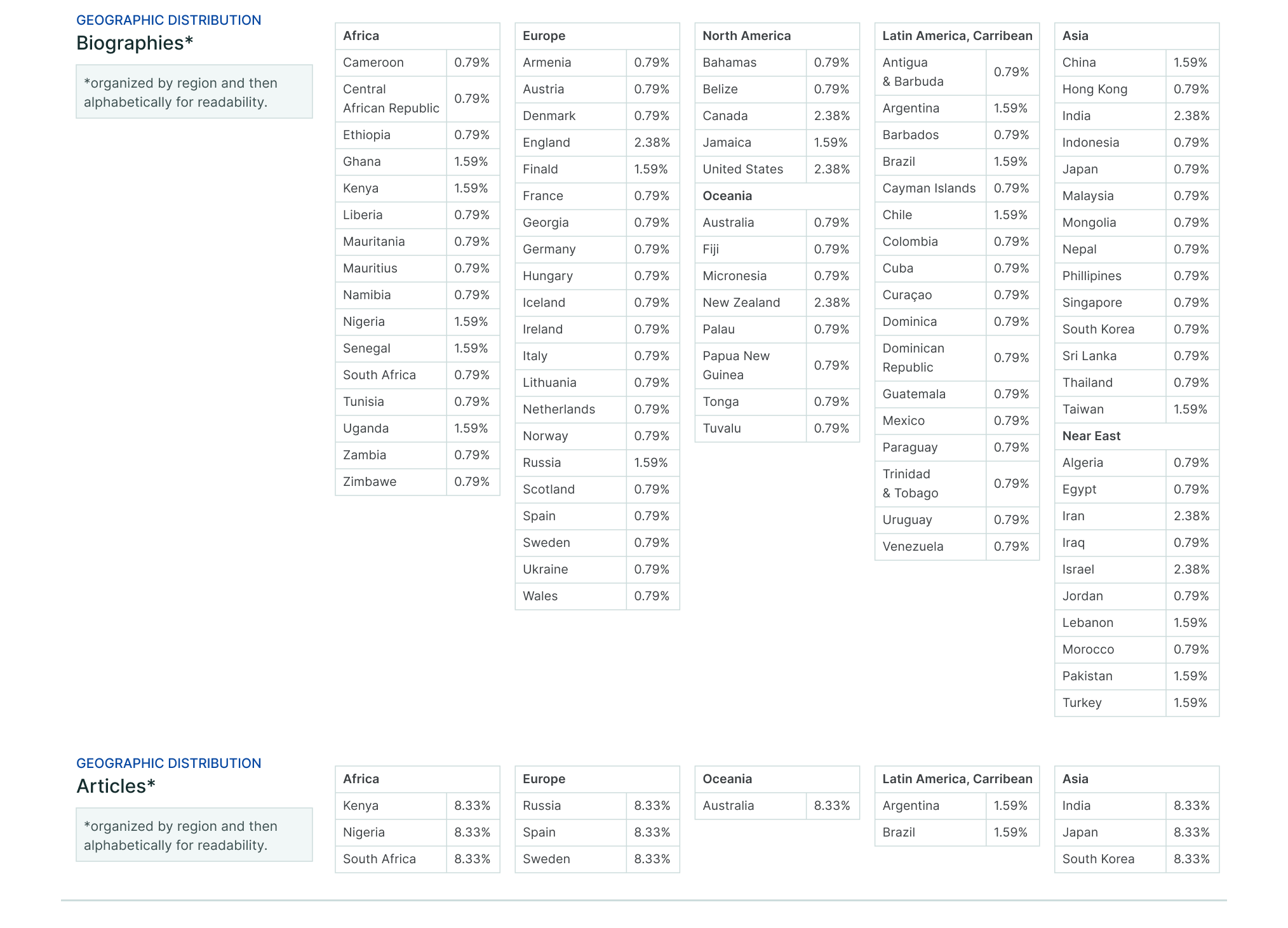
Consider the density and extent of your analysis and the corresponding insights to decide if your Data Card should contain raw data, data tables, or data visualizations.
Large and immersive tables and visualizations require time and attention that make them better suited as a standalone experience. In many cases, your readers will necessarily require some explanations of provenance or context for these kinds of tables and visualizations to be meaningful. In other cases, small tables and summary visualizations may emphasize one insight, but suppress another.
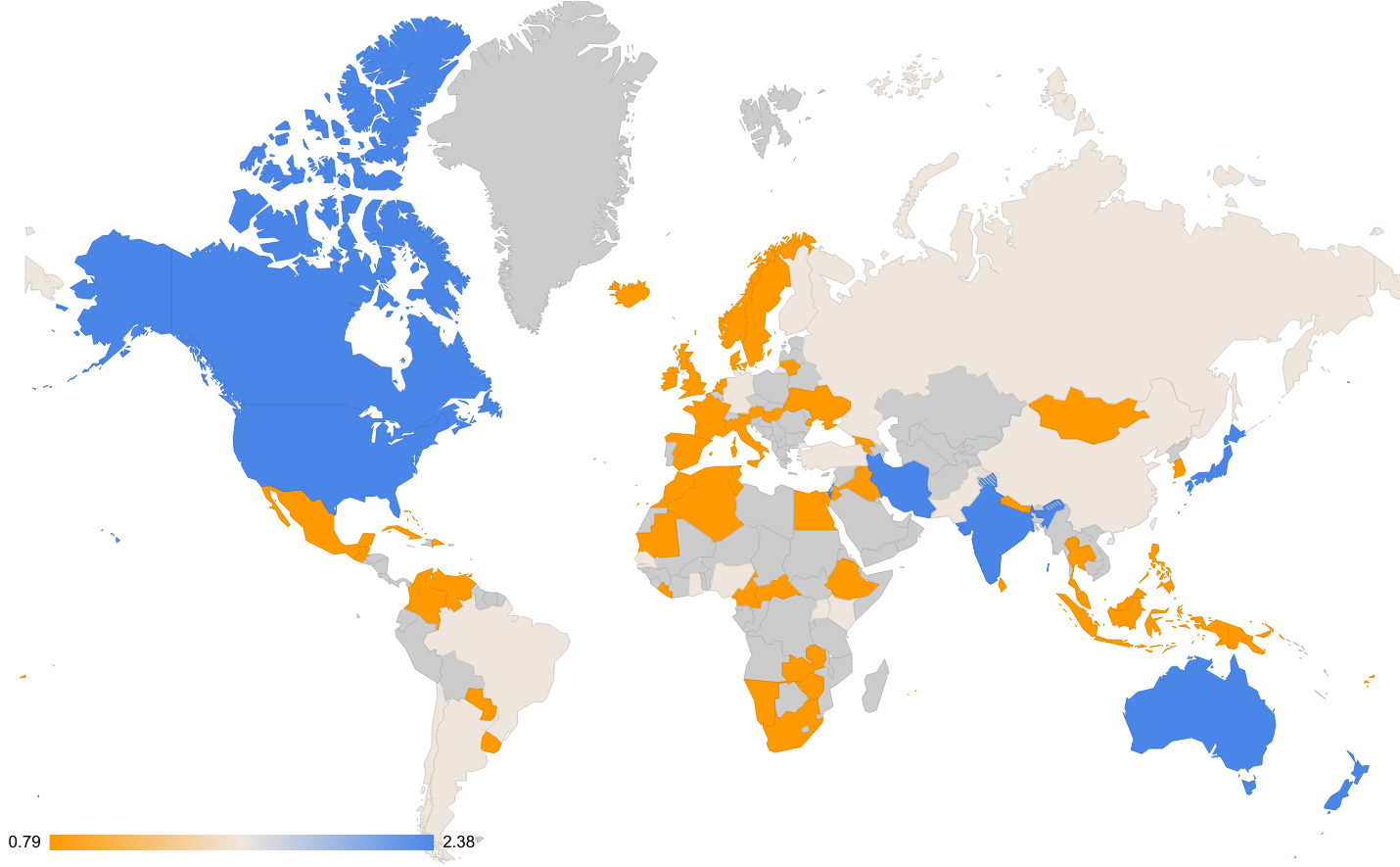
Visualizations should be accompanied by explanations.
Data Cards are intended to provide enough of an overview that readers who want to interact with exploratory visualizations or extensive tables have sufficient context. Use summary visualizations or tables to give readers a soft landing in the Data Card before diving deep into the data or analysis.
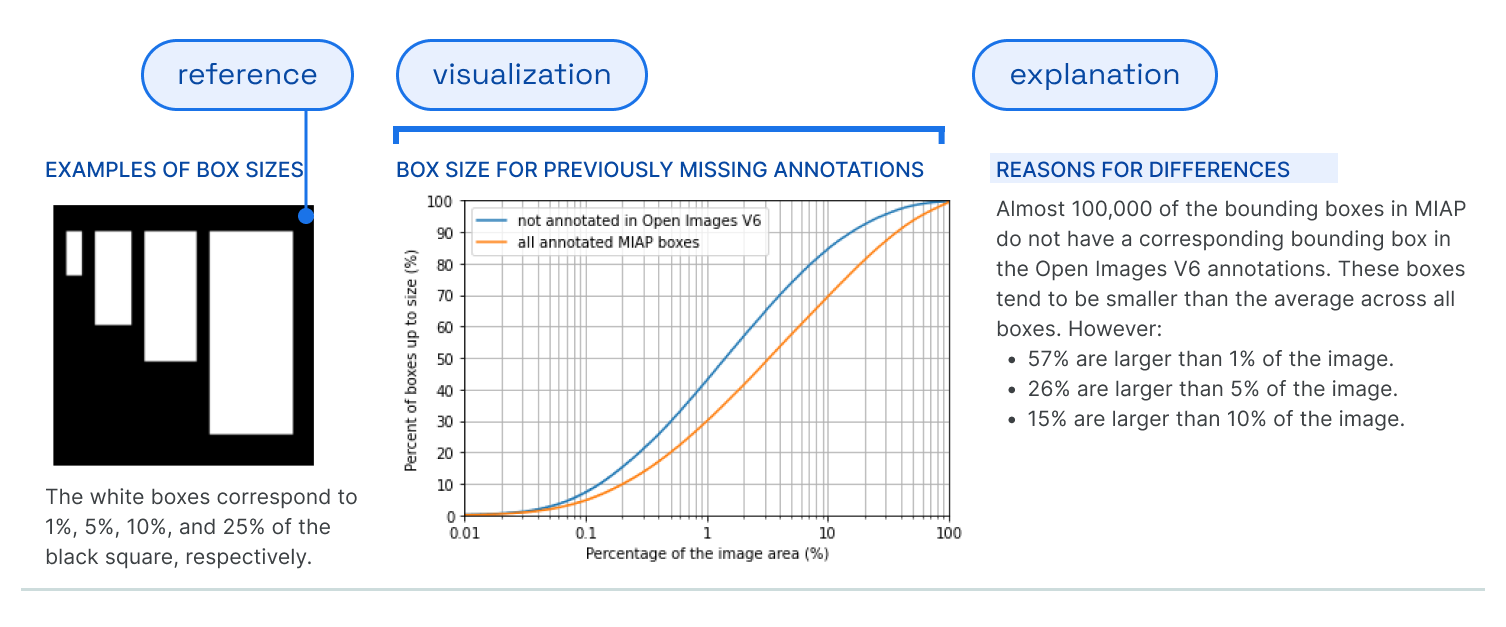
It’s important that all figures, tables, visualizations, and links to exploration demos be accompanied by a caption or context that communicates what your figure is trying to explain, and any considerations for readers to bear in mind.
Visualizations and tables can have drawbacks that should be taken into account.
Tables, depending on how they are sorted or nested, can emphasize or hide meaningful differences and similarities. Shorter tables are easier to scan, making it easier for readers to see differences in values. Longer tables that roll over to the next page are harder to read; visualizing these instead can make it easier. Visualizations can smooth over raw values that are within a close range of each other.
In these cases, you can represent your data better by shifting scope, such as by using aggregated results in tables or small multiples in visualizations.