Organize your content so you can guide your reader’s attention and build their understanding of the dataset.
Help readers’ attention so they can make sense of complex information by breaking it down into digestible chunks that are appropriately emphasized and arranged with a clear hierarchy in mind.
Data Cards are expected to succinctly communicate a lot of information about different facets of a dataset, all which are needed for downstream decision making. They support different modalities of information: long- and short-form text, tables, numbers, key value pairs, code blocks, data visualizations, tags, links, and demos of the data itself. They also contain functional metadata to establish the accountability and recency of Data Cards. Simple visual techniques to emphasize, de-emphasize, and arrange content can greatly influence decision making, trust, and control.
Introduce hierarchy in your content and its presentation to improve clarity and communication.
Break down large blocks of content using headings and subheadings that communicate the core idea of your content. This helps readers quickly locate information that they are looking for and establish its broader context. It also improves the accessibility of your content, while highlighting information that readers might not know they need.

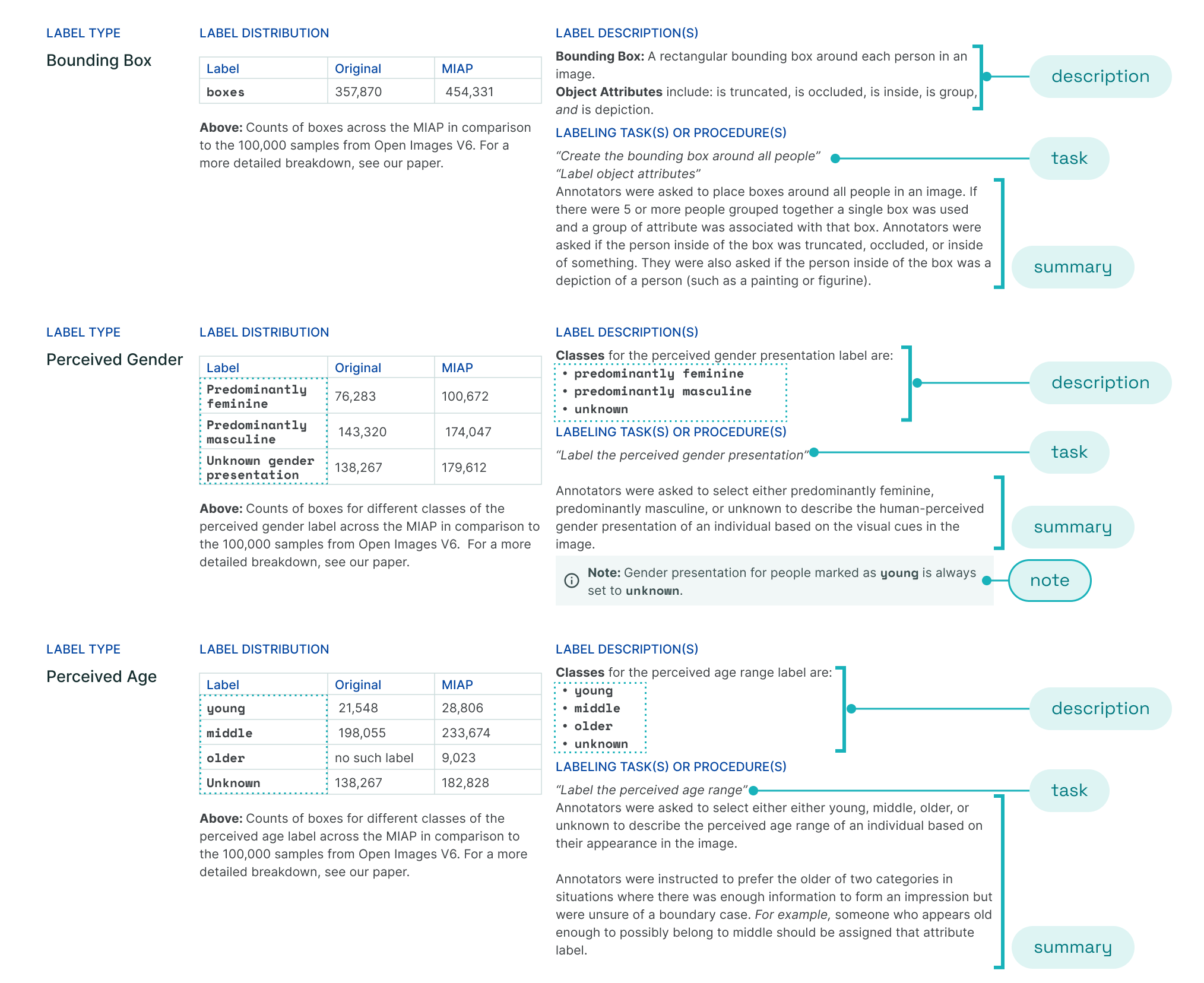
The More Inclusive Annotated Images Data Card uses hierarchy in a consistent manner across multiple sections to organize content into bite-size bits. This makes it easy for readers to build a balanced understanding of the dataset. Labels are formatted in a style that is different from the body text to highlight the distinction. A cautionary note is contained in a callout box.
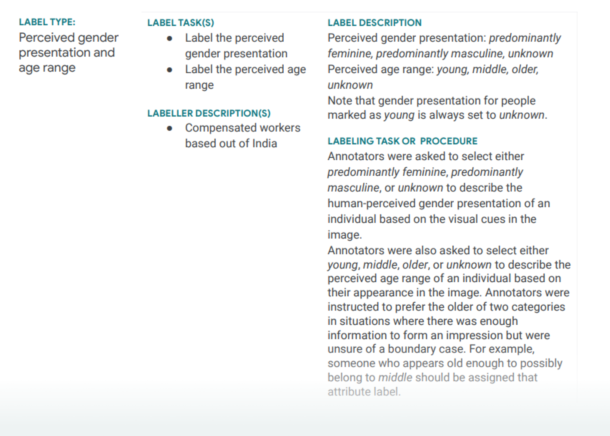
Over-emphasis can make Data Cards hard to read.
Emphasis and its absence are the backbone of hierarchy and structure. The way information is organized on a surface communicates denotative or direct meaning, and connotative or suggested meaning. Emphasis helps readers scan text, know when to start reading, and when to change context.
When everything is emphasized, nothing is truly emphasized. Adding undue emphasis using bolder fonts can break a reader’s flow, whereas a carefully placed call-out can add context and nuance for responsible AI development. Emphasize cautionary notes using callout boxes, but do so sparingly.
